Why a Smaller Screen Can Make Long Lines Easier to Follow
See how line length and column shape affect reading flow, then compare layouts to choose a screen that keeps text easy to track.
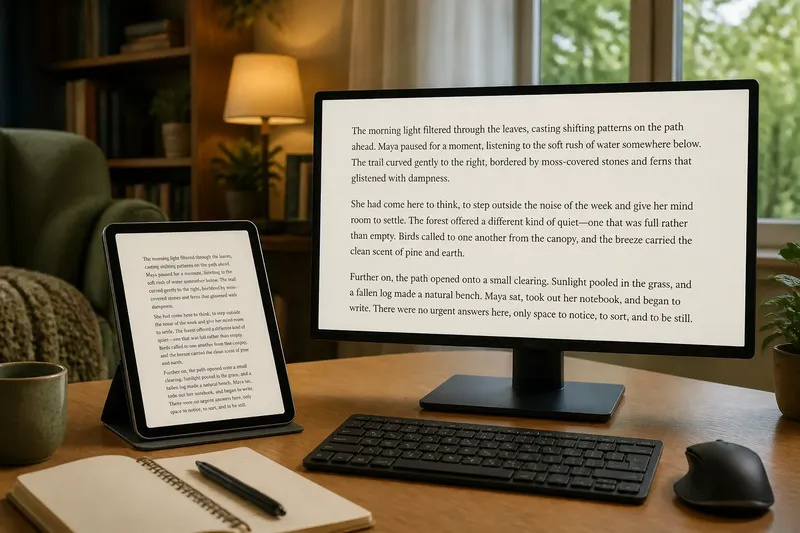
A narrow reading column can make long lines easier to follow, even on a small screen. When comparing screens for reading, focus on how the text is arranged—not on the frame alone.
A large monitor might show a centred column with generous margins, while a compact tablet might spread text almost edge to edge. The monitor’s layout could be easier to scan; the tablet’s might make each line feel sprawling. The useful question is how the text works in the place and position where you read.
Text column shape
Line length describes how much text fits across a line. It changes with the column width, typeface and letter size, so it cannot be inferred from a screen’s diagonal or physical width.
Very wide lines require a longer sweep from one end to the other, followed by a longer return to the next line. Very narrow lines break phrases often and prompt frequent returns. Look for a column that groups words clearly without making those movements feel awkward.
Line endings offer a practical clue. If many lines end with a short word or split a phrase in an unhelpful place, try a different column width or font setting before changing screens.
Layout controls
Changing the letter size alters how much text fits across a column. Larger letters generally mean fewer characters per line; smaller letters generally mean more. A typeface with broad letterforms also occupies more space than a compact one at a similar displayed size.
Start with letters that are comfortable to distinguish, then adjust column width if the reading flow feels off. Do not shrink text merely to fit more words on screen: the extra words may come at the cost of clear, easy tracking.
Reading apps may offer margins, column width, font and line-spacing controls. A browser’s zoom can affect both text and page layout, so check the actual result after each change rather than assuming the column will stay put.
Reading positions
The same column can look different when a screen is held in your hand, placed on a desk or viewed from across a room. Judge it from your usual position, including the angle at which you see the page and whether glare distracts from the text.
For a shared display, check whether the reading area is clear from each person’s seat. A column that feels centred to someone directly in front of the screen may sit awkwardly for a person viewing from the side.
For a screen that moves between places, compare it in the positions you actually use. A layout that suits a desk may not feel as natural in a chair or in your hands.
Compare reading layouts
Use the same passage on each screen so that you compare the layout rather than different writing. Match the reading conditions as closely as practical, and judge the actual text rather than the settings names in the app.
- Passage: Check that both screens show the same text; if the passages differ, use the same passage before judging line flow.
- Letter clarity: Check whether letters are easy to distinguish in your normal position; if not, enlarge the text, and compare the resulting layouts rather than keeping an uncomfortable size.
- Column width: Check whether lines sweep too far or break phrases often; if they do, narrow or widen the column, and keep the setting that makes line returns clearer.
- Line endings: Check whether short words or phrases are stranded at line ends; if that happens repeatedly, change the font or column width, and retain the setting with more natural groupings.
- Position: Check whether the column sits comfortably in your view; if you need to tilt or lean, reposition the screen or choose a layout that fits your normal posture.
- Glare: Check whether reflections obscure the text; if they do, change the screen angle or location, and reassess the column from that position.
- Long passage: Check the layout across several paragraphs; if line returns become tiring, adjust one control and read again, otherwise stop changing settings.
Say you are choosing between a compact tablet and a wide monitor for long articles. Imagine the tablet displays the passage in a centred column, while the monitor initially stretches it across the full page. You open the monitor’s reading view, narrow its column and find that both screens now group words similarly; if the monitor’s text also remains easy to read from your usual chair, its wider frame need not make the lines harder to track. If its controls cannot produce a comfortable column, the tablet may be the better fit for that reading task.
Why choose a smaller screen?
Does a smaller screen always have shorter lines?
No. An app may use almost the full width of a compact display, while a larger screen can show a narrow central column. Compare the text actually on the page rather than the frame.
Should I reduce text size?
Only if the letters remain easy to distinguish where you normally read. If the lines feel too long, try changing the column width first.
What if line endings feel awkward?
Adjust the column width or font, then read a full paragraph again. Keep the change only if the words form clearer groups and the return to each new line feels more natural.
Does a centred column help?
It can keep the text in a consistent part of your view, particularly on a wide screen. Check its position from your usual seat or grip; centring alone does not make a column comfortable.
Choose for the task
Screen size still matters for fitting a device into its intended place and keeping text clear from the usual viewing position. But frame size does not tell you whether a page uses its width well. Check the app’s available controls and the reading area they actually produce.
Not worth the effort: tuning a layout for a single heading or a few lines. Use a passage long enough to reveal repeated line returns, make a small number of sensible adjustments, and stop when the text is clear and comfortable in its normal setting.
For comparing screens for reading, judge the column shape alongside letter clarity and position. A smaller screen can make long lines easier to follow if its layout keeps the text in a clear, manageable column; a larger one can do the same with a suitable reading view. Choose by the page you can comfortably follow, not by how much of the frame the text fills.